Defining Flex Ad Containers
- Scaled Padding Container Definition
- Scaled Image Container Definition
- Javascript Scale Container Definition
Previous ad element targeting techniques focused on making it easy for publishers to drop ad units in their content to gain revenue. A particular DIV is targeted and taken over by the ad unit when it arrived, or a piece of synchronous Javascript code is placed in the page at the location where the ad unit will be served. While this makes the inclusion of ads simple, the user experience suffers. There is a discernable stutter in the page, making content shift on the end user while they are attempting to read the page.
Flexible ad units pre-define an aspect ratio for the ad instead of using fixed pixel units. The ad then fills the available space allocated to it, maintaining its aspect ratio. This is more in line with modern web page authoring techniques that use media queries and CSS breakpoints to adjust page layout for an optimal user experience based on the device the content is being viewed on.
One question becomes where responsibility lies for enforcing the aspect ratios: with the Publish, with the Ad Creative vendor, or both. If the responsibility is solely with the Publisher page stutter is eliminated and the creative unit can simply fill all available space. The downside is that if the publisher makes a mistake in setup of the container, the ad unit may not render correctly. Placing responsibility solely with the Creative vendor does not address the issue of page layout stutter. The responsibility should lie with both parties.
Publisher Slot definition - CSS
At the time of writing there is no perfect technique available using CSS only to define a container that holds fixed aspect ratios. Multiple techniques were evaluated to create a container that maintained a scaleable aspect ratio and none were perfect. Achieving a scaled aspect ratio container with CSS requires overlaying two different elements within a wrapping element to achieve the aspect ratio and the ad creative container.
Scaled Padding Technique
The first technique utilizes a full width div (width:100%) with top padding set to the percentage required for the aspect ratio. Another absolutely positioned element is then overlain on the aspect ratio div to the the injection target for the ad creative. At time of writing this is the preferred technique for defining flexible ad unit containers.
Ad unit stylesheet available for usage. Below explanation shows inline styles for illustrative purposes only.
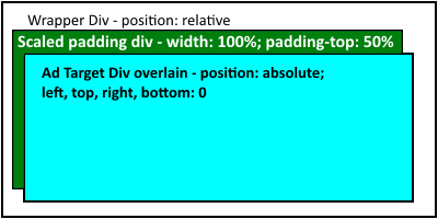
The first step is to create an enclosing block or inline-block level wrapping element. This element declares relative positioning to establish a new coordinate placement system internally for the flex scaled content. The second step is to add a block level element that has a width of 100% and a padding-top of the desired aspect ratio. These style settings direct the browser to fill available width and linearly scale the image height. The final part is to create the ad targeting container. This should be an absolutely positioned element with all four of top, bottom, left, and right set to zero. The effect of doing this tells the element to stretch to the edges of its container while being absolutely positioned over the top of other elements.
<div style="display:block;position:relative;>
	<div style="display:block;width:100%;padding-top:25%;" ></div>

	<div id="ad_target_element" style="position:absolute;left:0;top:0;right:0;bottom:0;" >
	</div>

</div>
Examples in Action - CSS Padding Scaled Containers
Scaled Image Technique
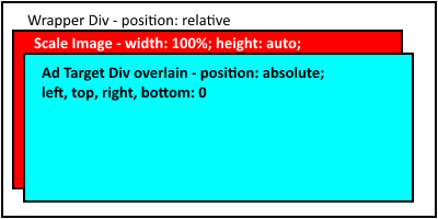
A very similar technique is to utilize an image of the desired aspect ratio and to scale the image to size, then overlay another element into the scaled container to hold the ad unit. Scaled images are supported in all modern browsers.
The image can be minimally defined to the correct aspect ratio and be simple, transparent pixels. For purposes of illustration, below is an 8x1 image scaled into different container sizes. It will retain it's scale size as the container or the browser resizes. The top image has no scaling applied.
 Unscaled
Scaled 50%
Scaled 25%
Unscaled
Scaled 50%
Scaled 25%
The first step is to create an enclosing block or inline-block level wrapping element. This element declares relative positioning to establish a new coordinate placement system internally for the flex scaled content. The second step is the add the image as a block level element that has a width of 100% and a height of auto. These style settings direct the browser to fill available width and linearly scale the image height. The final part is to create the ad targeting container. This should be an absolutely positioned element with all four of top, bottom, left, and right set to zero. The effect of doing this tells the element to stretch to the edges of its container while being absolutely positioned over the top of other elements.
<div style="display:block;position:relative;>
	<img src="adsize_8x1.png" style="display:block;width:100%;height:auto;" />

	<div id="ad_target_element" style="position:absolute;left:0;top:0;right:0;bottom:0;" >
	</div>
</div>
One obvious concern with this technique is the additional request for the image and if any weight is being added to the page. The size of the image can be made very minimal. By reducing to the minimum pixels for the aspect ration (for 8x1 this is one pixel high and 8 pixels wide) and making them all transparent, the image is about 170 bytes. We can further optimize by running the image through pngcrush, yielding a 70 byte image.
Image file optimization doesn't address the issue of an additional network request. A claim can be made that browser caching will handle this issue, but this will only be partially true. Instead we can directly embed the image by creating a data URL and base64 encoding the image. The end result is an image tag where the embedded data is shorter than most tracking pixel paths. Below is our full tag for the 8x1 flex sizing image as a data embed.
<img src="data:image/png;base64,iVBORw0KGgoAAAANSUhEUgAAAAgAAAABCAYAAADjAO9DAAAAEElEQVQI12P4//8/GwMeAABdcgME8m91jwAAAABJRU5ErkJggg=="
	style="display:block;width:100%;height:auto;" />
Examples in Action - CSS Scaled Image Containers

Other CSS Techniques
The above techniques are simply what we found to work today. They will no doubt be superceeded in the future as CSS continues to evolve. In certain narrower scenarios you may find other techniques that are superior for your given situation. Consider working with CSS calc() or experimenting with CSS grid display.
Javascript Scaled Container Technique
Another reliable technique for setting the scaled size of the ad container is the utilize Javascript to size things with code. This technique provides finite control over element behavior and scaling and is well understood in modern browsers. The downside is that the technique requires a lot of custom event registration and wire-up, and there is a small stutter before the script events execute (depending on browser and device). This stutter can be witnessed through successive page refreshes of this page.
Examples in Action - Javascript Scaled Image Containers
There are an infinite amount of ways to utilize Javascript for wiring up flex scaling of ad unit containers. The method displayed here utilizes data-* attributes to define the scale size and then attaches to window.onresize. Below is the markup used in the above sample.
<div class="flex-ad-unit script-ad-unit" data-flex="8x1" >Flex ad unit</div>
In our example we utilize CSS class names to allow the script to identify ad units. The data-flex attribute identifies the aspect ratio. This is parsed and used to calculate the height based on the width.
var setSize = function(){
	var ads = document.querySelectorAll('#scriptScaledElements .script-ad-unit');
	var i, slot, flex, sizes, ratio, wd, scaleHt;
	for(i=0;i<ads.length;i++){
		slot = ads[i];
		flex = slot.getAttribute('data-flex') || '1x1';
		sizes = flex.split('x');
		ratio = sizes[1]/sizes[0];
		wd = slot.offsetWidth;
		scaleHt = wd * ratio;
		slot.style.height = new String(scaleHt) + 'px';
	}
};

// set the initial size
setTimeout(setSize, 1);

// attach for resizing
window.addEventListener('resize', setSize);
If you resize the page you can see both the CSS and the script examples behave as expected. The difference is that the script examples have more bulk for a small number of ads and the event wire-up is more error prone.